Introduction
This is the documentation for Evolution Forms.
Prerequisites
- Tested up to Worpdress 6.3
Installation
Using Wordpress
- Go to Plugins → Add new
- Click Upload Plugin (at the top)
- Browse for
mwitd-evfo*.zip - Click Install Now
Via FTP
- Unpack
mwitd-evfo*.zip - Upload the
mwitd-forms2folder towp-content/plugins/ - In Wordpress, go to Plugins and look for Evolution Forms, click on Activate
After Evolution forms has been installed and activated, its license needs to be activated in order to unlock all features. This is described in detail in the following step.
License Activation
With the purchase of Evolution Forms, you obtain a license key which is needed to unlock all features of the plugin.
The license key is displayed right after the purchase and in the confirmation email. You can also log in with your email address here and see all of your license keys: User Area - Evolution Forms
The license key can be entered in the Wordpress admin dashboard.
After successfully activating Evolution Forms, all features will be unlocked.
Should you experience and problems with the activation process, don't hesitate to contact us: Support - Evolution Forms
Form list
In the overview forms can be created, imported, export and removed.
Create new Form
This button opens the editor with an empty form.
Shortcode
Forms can be embedded on pages using this code. Copy and paste it into any page you would like the form to appear. Multiple forms per page are supported.
Date
Date the form was last changed.
Actions
Edit
Opens the form in the editor.
Export
Downloads the form as a file. This can be used as a backup or to transfer the form to a different website.
Duplicate
Creates a copy of the form.
Remove
Removes a form from the list. Answers to removed forms can still be viewed.
Form Editor
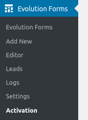
New forms can be created in the Wordpress admin menu: Evolution Forms → Add new.
Already created forms can be found in the forms overview by clicking on Evolution Forms in the sidebar.
Form Title
The form title is displayed above the form by default. It can be hidden in the form settings. The form title also appears in the confirmation mails for users.
Edit Form
You will find three tabs at the top of the editor page: Edit Form, Edit Design and Edit Settings.
An empty form is created with two steps. Existing steps can be found in the left sidebar of the editor.
New steps can be added with the Add Step button. Clicking this button opens a window that lets you choose from all available form element types which are explained here.
End ("Thank you" page)
Please note that this step is always shown after the user submits the form data. You can use this page to thank the user for their participation. You can also leave this page empty in case a redirection is set up in the form settings.
Save
The Save can be found in the top right and bottom right of the editor.
Form Elements
General Element Settings
Some settings apply to all elements:
Hide Title
Hides the title of the form element. A title should be entered even if the title is hidden since it will still appear in the lead view.
Required
Expects the user to fill out this element. A notification will be shown if the user tries to proceed without filling out the element.
Display
Element: Text
This element displays any content.
Element: Heading
This element displays a heading over the current form step. Its position in the editor does not matter, it will always be shown at the top.
Inputs
Element: Selection
The selection element can be used to ask for a choice of multiple options.
Automatically advance to the next step on selection: When this is enabled, the form will automatically advance to the next step when an option is selected.
Allow selection of multiple options: When this is enabled, multiple options can be selected instead of just one.
Layout
Lets you select in how many columns the options are displayed.
Default uses as many columns as possible. The other options restrict the amount of options per row.
Options
New options can be added with the Add New Option button.
An option can be represented by plain text (next to a checkbox or radio button) or by an image.
To use an image, select the Use Image option. You can then select an image from your WordPress library.
Alternatively, select Use Icon to select an icon from the FontAwesome library.
You can optionally also hide the option's title if the image or icon is enough. For this, activate the "Hide Title" option.
Element: Checkbox
This element displays a single checkbox which can be used to ask for consent (e.g. over terms of services).
Element: Privacy Policy Checkbox
This element displays a single checkbox which can be used to ask for consent (e.g. over terms of services).
The text can be freely edited. *link* will be replaced by the link text set below. The destination page can also be set, e.g. to the privacy policy page or the terms of service.
Element: Text Input
An element for simple text input.
Element: Text Area
An element for multi-line text input.
Element: File Upload
This element allows visitors to upload files. The element can be configured to accept multiple files and certain file types.
Element: Honeypot
This element can be used to counter spam bots. This element is invisible and could technically only be filled out by bots. Give it a generic title like "Name" or "Email". The form will not advance to the next step if this element has been filled out. Users will not be able to see or interact with this element.
Element: Range
This element lets users enter a number using the range slider. Minimum, maximum, step size and the initial value can be set. There is also an option for a symbol to be displayed next to the selected number.
Address
Element: Email
Similar to Text Input. The input will be checked if it resembles an email address.
Other Address Elements
These elements are regular text inputs. However, they are saved with an identifier so forms submissions can be filtered for name, street, zip code, city, phone, etc.
Embeds
Element: Calendly
This element embeds Calendly. You can select elements for prefilling the name and email fields in Calendly. These elements need to be at least one step before the Calendly element.
If you ask for name and email steps earlier in the form they can be prefilled in Calendly and don't have to fill out twice.
Required: If activated continue is predicted when no booking was done.
After booking continue automatically: If a booking was done go automatically to the next form step.
Calendly link:
The Calendly link (e.g. https://calendly.com/testname or https://calendly.com/testname/30min)
Prefill Name: If activated you can select one element that can be used to prefill the name in the calendly form. The prefill element need to be at least one step before the calendly element. It need to be one of the following elements: textinput, textarea, mail, firstname or lastname.
Prefill Mail:
If activated you can select one element that can be used to prefill the mail in the calendly form.
The prefill element need to be at least one step before the calendly element. It need to be one of the following elements: textinput, textarea, mail, firstname or lastname.
Example Form
This form can be used to import in the calendly element.
eyJpZCI6IjI0MSIsInRpdGxlIjoiQ2FsZW5kbHkgRWxlbWVudCBUZXN0IChkZSkiLCJzdGVwcyI6W3sidW5pcXVlSUQiOjMsInRpdGxlIjoiTmFtZSB1bmQgRS1NYWlsIiwibGF5b3V0IjoiZXZmb19ncmlkLS1vbmVfY29sdW1uIiwiZWxlbWVudHMiOlt7InVuaXF1ZUlEIjoxMSwidGl0bGUiOiI8cD5OYW1lIHVuZCBBZHJlc3NlIHdlcmRlbiBhbiBDYWxlbmRseSB3ZWl0ZXJnZWdlYmVuLCBzb2Rhc3Mgc2llIG51ciBlaW5tYWwgZWluZ2VnZWJlbiB3ZXJkZW4gbcO8c3Nlbi48L3A+IiwidHlwZSI6InRleHQiLCJoaWRlVGl0bGUiOmZhbHNlfSx7InVuaXF1ZUlEIjo2LCJ0aXRsZSI6Ik5hbWUgenVtIHZvcmF1c2bDvGxsZW4iLCJ0eXBlIjoiZmlyc3RuYW1laW5wdXQiLCJoaWRlVGl0bGUiOnRydWUsInJlcXVpcmVkIjp0cnVlfSx7InVuaXF1ZUlEIjoxMCwidGl0bGUiOiIiLCJ0eXBlIjoic3BhY2VyIiwiaGlkZVRpdGxlIjpmYWxzZSwic3BhY2VySGVpZ2h0IjoiMjAifSx7InVuaXF1ZUlEIjo1LCJ0aXRsZSI6IkUtbWFpbCB6dW0gdm9yYXVzZsO8bGxlbiIsInR5cGUiOiJlbWFpbGlucHV0IiwiaGlkZVRpdGxlIjp0cnVlLCJyZXF1aXJlZCI6dHJ1ZSwic2VuZENvbmZpcm1hdGlvbkVtYWlsIjpmYWxzZX1dLCJjb25kaXRpb25zIjpbXX0seyJ1bmlxdWVJRCI6MCwidGl0bGUiOiJDYWxlbmRseS1FbGVtZW50IiwibGF5b3V0IjoiZXZmb19ncmlkLS1vbmVfY29sdW1uIiwiZWxlbWVudHMiOlt7InVuaXF1ZUlEIjoyLCJ0aXRsZSI6IiIsInR5cGUiOiJjYWxlbmRseSIsImhpZGVUaXRsZSI6ZmFsc2UsImVtYmVkTGluayI6Imh0dHBzOi8vY2FsZW5kbHkuY29tL2F6b29yYTIvMzBtaW4iLCJyZXF1aXJlZCI6dHJ1ZSwicHJlZmlsbE5hbWUiOnRydWUsInByZWZpbGxFbWFpbCI6dHJ1ZSwicHJlZmlsbE5hbWVVbmlxdWVJRCI6NiwicHJlZmlsbEVtYWlsVW5pcXVlSUQiOjUsImFkdmFuY2VPblNlbGVjdGlvbiI6ZmFsc2V9XSwiY29uZGl0aW9ucyI6W119LHsidW5pcXVlSUQiOjEsInRpdGxlIjoiIiwibGF5b3V0IjoiZXZmb19ncmlkLS1vbmVfY29sdW1uIiwiZWxlbWVudHMiOlt7InVuaXF1ZUlEIjo4LCJ0aXRsZSI6IjxoMj5WaWVsZW4gRGFuayE8L2gyPiIsInR5cGUiOiJoZWFkaW5nIiwiaGlkZVRpdGxlIjpmYWxzZSwibGF5b3V0IjoiYWxpZ24tbGVmdCJ9LHsidW5pcXVlSUQiOjcsInRpdGxlIjoiPHA+V2lyIG1lbGRlbiB1bnMgYmVpIGRpci48L3A+IiwidHlwZSI6InRleHQiLCJoaWRlVGl0bGUiOmZhbHNlfV0sImNvbmRpdGlvbnMiOltdfV0sInNldHRpbmdzIjp7ImdlbmVyYWwiOnsiaGlkZUZvcm1UaXRsZSI6ZmFsc2UsImhpZGVOYXZpZ2F0aW9uQnV0dG9ucyI6ZmFsc2UsImRpc2FibGVCYWNrQnV0dG9uIjpmYWxzZSwiaGlkZVByb2dyZXNzQmFyIjpmYWxzZSwibm90aWZpY2F0aW9uRW1haWxBZGRyZXNzIjoiIiwiY29uZmlybWF0aW9uRW1haWxTZW5kZXJBZGRyZXNzIjoiIiwiY29uZmlybWF0aW9uRW1haWxTZW5kZXJOYW1lIjoiIiwiY29uZmlybWF0aW9uRW1haWxTdWJqZWN0IjoiIiwiY29uZmlybWF0aW9uRW1haWxNZXNzYWdlIjoiLi4uIiwiY29uZmlybWF0aW9uRW1haWxGb290ZXIiOiIuLi4iLCJkYXRhUmVtb3ZhbFBhZ2VJRCI6IjI3OCIsInJlZGlyZWN0QWZ0ZXJTdWJtaXNzaW9uIjpmYWxzZSwic2VuZERhdGFUb1Zpc2l0b3IiOmZhbHNlLCJzZW5kRGF0YVRvQWRtaW4iOmZhbHNlLCJyZWRpcmVjdFRhcmdldCI6IiJ9LCJkZXNpZ24iOnsicmFpc2VQbHVnaW4iOmZhbHNlLCJzZWxlY3Rpb25UZXh0T3V0c2lkZSI6ZmFsc2UsImNvbG9yTWFpbiI6IiMxZDJmOGMiLCJjb2xvckJhY2tncm91bmQiOiIjZmNmY2ZmIiwiY29sb3JGb250IjoiIzAwMDAwMCIsInVzZUNvbG9yRm9udCI6ZmFsc2UsImNvbG9yRm9udEZyb21UaGVtZSI6ZmFsc2UsImNvbG9yRm9udEF1dG9tYXRpYyI6dHJ1ZSwiY29sb3JGb250QnV0dG9ucyI6IiMwMDAwMDAiLCJ1c2VDb2xvckZvbnRCdXR0b25zIjpmYWxzZSwiY29sb3JCdXR0b25zIjoiIzAwMDAwMCIsInVzZUNvbG9yQnV0dG9ucyI6ZmFsc2UsImNvbG9yRnJhbWUiOiIjMDAwMDAwIiwiaGlkZUZyYW1lQW5kQmFja2dyb3VuZCI6ZmFsc2UsInVzZUNvbG9yRnJhbWUiOmZhbHNlfSwib3ZlcndyaXRlcyI6W119fQ==
Element: Meetergo
This element embeds Meetergo. You can select elements for prefilling the firstname, lastname, fullname, email and phone fields in Meetergo. These elements need to be at least one step before the Meetergo element.
If you ask for firstname, lastname or fullname, email and phone steps earlier in the form they can be prefilled in Meetergo and don't have to fill out twice.
Required: If activated continue is predicted when no booking was done.
After booking continue automatically: If a booking was done go automatically to the next form step.
Meetergo link:
The Meetergo link (e.g. https://my.meetergo.com/username/new-meeting)
Prefill First Name: If activated you can select one element that can be used to prefill the firstname in the meetergo form. The prefill element need to be at least one step before the meetergo element. It need to be one of the following elements: textinput, textarea, mail, phone, firstname or lastname.
Prefill Last Name: If activated you can select one element that can be used to prefill the lastname in the meetergo form. The prefill element need to be at least one step before the meetergo element. It need to be one of the following elements: textinput, textarea, mail, phone, firstname or lastname.
Prefill Full Name: If activated you can select one element that can be used to prefill the fullname in the meetergo form. The prefill element need to be at least one step before the meetergo element. It need to be one of the following elements: textinput, textarea, mail, phone, firstname or lastname.
Prefill Mail:
If activated you can select one element that can be used to prefill the mail in the meetergo form.
The prefill element need to be at least one step before the meetergo element. It need to be one of the following elements: textinput, textarea, mail, phone, firstname or lastname.
Prefill Phone:
If activated you can select one element that can be used to prefill the phone in the meetergo form.
The prefill element need to be at least one step before the meetergo element. It need to be one of the following elements: textinput, textarea, mail, phone, firstname or lastname.
Steps
Design
The Design settings allow you to set the form's appearance.
Main
Main Color
The main color defines the accent color of the form. This includes the buttons, frame and loading symbol. This color can be overwritten by the options further below.
Background Color
The background color defines the background of the form. This color can be set to anything you like. The font color will be adjusted automatically so it can be read easily (e.g. the font color is white on dark backgrounds and black on bright backgrounds).
Font Color (overwrite automatic color)
Enable this option to overwrite the automatically set font color. This applies to all text in the form, excluding text on buttons.
Buttons
Button Color
Enable this option to overwrite the default color for buttons. The font color will be adjusted automatically, unless overwritten by the font color option below.
Font Color on Buttons
Enable this option to overwrite the automatically set font color for buttons.
Frame
Frame Color
Enable this option to overwrite the main color for the form's frame.
Misc.
Raise plugin
Some setups might require the form to be further in the foreground if it is hidden by other elements on the website. Enable this option to raise it further towards the top.
Einstellungen
Globale Einstellungen überschreiben
Gibt die Einstellungen für das Formular frei. Ansonsten gelten die globalen Einstellungen.
General
Form Title
Hide Form Title
Hides the form title which is usually displayed at the top of the form.
Navigation Buttons
Hide Previous / Next Buttons
Hides the navigation buttons on all form steps. Only use this if you have Selection elements set up with "Automatically advance to the next step on selection".
Disable back button
Disables the Back navigation button so that changes cannot be made to previous steps.
Progress Bar
Hide Progress Bar
Hides the progress bar which is usually displayed at the top of the form.
Email address for notifications
A notification email is sent to this address whenever a form has been filled out.
Name of sender
"From" name to use when a form is configured to send a notification email to the visitor
Confirmation Email Message
Message for the email that gets sent out whenever a visitor completes a form. (Text or HTML)
Confirmation Email Footer
Content of the email's footer. This can be used for contact information or links.
Data Removal Page
Page to be used for user data removal requests. This is the page that will open when users click on the data removal request link in the confirmation mail. Any empty page will do: Evolution Forms will fill it automatically.
Redirection
Redirect after Submission
Whether the visitor should be redirected to a different URL when they clicked on "Submit".
Reditrection Target
URL to redirect to in case the option above is selected.
Shortcode
Forms can be embedded in any page by using the evfo shortcode.
A shortcode looks like this:
[evfo id="1" form-location="second form on home page"]
You can find a form's shortcode under Evolution Forms in the form list. You can click to select it, then use CTRL + C or right click → Copy.
The shortcode uses two parameters:
id determines which form to load.
form-location is a description that you can set. This is useful if you use the same form in different locations, for example one at the top and the other one at the bottom of the page. This way you can find out where on the site the users filled out your form.
Leads
All form responses (leads) can be found under Evolution Forms → Leads in the WordPress admin dashboard.
Forms
The overview provides a list of all created forms. The following statistics can also be read from it:
Completed Runs: The number of complete form submissions.
The list of runs can be opened by clicking on any of the links in the list.
Runs
The overview of a form's responses provides information about the time of completion and the email address of the person who submitted the information (if the form contains an email element).
Run: This is either the email address of the sender if the form does not contain an email element.
Date: The date when the form was submitted
Completed: Shows whether the submission is complete.
Actions
Remove: Removes data of this response. This cannot be undone.
Lead
The overview of a single form response shows all form answers that were submitted.
Completed: Date when the data was submitted
Duration: The time needed to fill out the form
Logs
In the logs overview you can find a list of actions and when they were performed:
-
Form removals
-
Sent notifications
-
Data removal requests
Troubleshooting
API
Overview
Evolution Forms uses the REST API WordPress provides and defines two routes to retrieve form data and form response data (leads). In order to use the API, the extension has to be purchased from the Extensions menu.
Base URL
In order for the API to work, the permalink setting in WordPress needs to be set to Post name (/wp-admin/options-permalink.php on your WordPress instance). HTTPS needs to be enabled.
Evolution Forms provides
/evolution-forms/v1/responses
and
/evolution-forms/v1/forms
Here's an example for a complete URL:
https://test.evolution-forms.com/wp-json/evolution-forms/v1/responses
Authentication
The API uses application passwords which have to be generated in the WordPress user settings.
Test Authentication
You can test your credentials with cURL:
curl --user "USERNAME:APPLICATION_PASSWORD" https://test.evolution-forms.com/wp-json/wp/v2/users/me
Replace USERNAME and APPLICATION_PASSWORD with your credentials.
Routes
/wp-json/evolution-forms/v1/forms
Information about available forms
Parameters:
formIDs (Array of integers): Which forms to query for. Leave empty to retrieve all forms. Can also be specified in the route: /wp-json/evolution-forms/v1/forms/23
/wp-json/evolution-forms/v1/responses
Form responses (leads)
Parameters
formIDs (array of integers): Which forms to query for. Leave empty to retrieve responses to all forms.
responseIDs (array of strings): Which specific responses to pick.
page (integer: Number of page. Leave empty to retrieve all responses at once.
detailed (boolean): Merges all steps from the steps array so that all element responses are in one large array called elements. Also adds stepID, dateStart and dateEnd to element responses.
Examples
Responses to forms 22 and 33:
https://test.evolution-forms.com/wp-json/evolution-forms/v1/responses?formIDs[0]=22&formIDs[1]=33
Response with ID htUpIvGeNFadxpYk3jCPxXPXm:
https://test.evolution-forms.com/wp-json/evolution-forms/1v1/responses?responseIDs[0]=htUpIvGeNFadxpYk3jCPxXPXm
Zapier
Zap - EvoForms & Brevo
In the following section you get some information about connecting Evolution Forms with a CRM-Tool like Brevo.
Requirements:
- EvoForms API-Extension is installed
- Wordpress Application Password is generated
- Zapier is connected to EvoForms
Brevo (formerly known as SendInBlue)
Follow these Steps to configurate Brevo for Zapier.
- On top right click profile and further SMTP & API
- Checkout the Tab API-Key
- On the right click the button Create new API-Key
- Now a window opens. Type in the name of the interface (e.g. Zapier API) and click Generate
- Now you see the full generated API-Key
IMPORTANT: Copy the API Key to you clipboard and store it in a safe place. The key cannot be displayed afterwards.
- Open Zapier and click Apps in the sidebar
- Search for "Brevo" and click Connect
- A window opens. Type in the api key for brevo. Submit.
Now the app "Brevo" is connected with Zapier. You can start to automate your process with a zap.
Set-up Zap
Trigger
- In the sidebar on the left click + Create Zap (orange button)
- Now a window opens. Click on Trigger
- Select the trigger Evolution Forms
- On the right side a window opens. At App & event select one of the 2 Events. Choose from "New Form" or "New Lead". In this case use New Lead. Continue.
- Select connected EvoForms account, if not already done automatically.
- At Action select one of the forms created in EvoForms on your worpress page
- At Test select a Lead that contains all of your required data.
PEASE NOTE: It is recommended to call a test request with evolution forms. Be shure to fill in the gaps of all fields which data you need to handle in Zapier. If the leads not displayed immediately, push the button Find new records to find the newest leads.
- Select one data set and click "Continue with selected record"
Action
- In the graphical user interface in the middle of the screen select the field which you want to use as a action element.
- A new window opens on the right. At point App & event select Brevo if not already done automatically.
- In the required field Event select Add or Update Contact
- At Account look if the right brevo account has been entered
- At Action there fields like Email, Mobile number of contact, Lists, Update Type, Attributes, Treat values as category ID for attributes of type
category5.1 For Email assign a value of EvoForms, if exist 5.2 For Mobile number of contact assign a value of EvoForms, if exist 5.3 For Lists select one or more list(s) from Brevo, in which the data from the leads are to be entered 5.4 Set Update Type to Add 5.5 Under Attributes further fields of one list in Brevo can be accessed. Just type in the the attribute of brevo in uppercase letters (e.g. FIRST NAME OR SMS) and connect it with a value of EvoForms. 5.6 Set "Treat values as category ID for attributes of typecategory" to false except of the case you want to access an attribute of brevo which has the type "category" by category-id and not the value. - At Test click the button Test step. If successful Publish the zap.
Google Docs
Changelog
Version numbers represent the publication date.
E.g. version 20.1207 was published on the 7th of December, 2020.
23.1009
- Bugfixes
- Access to new user area
- Reset statistics of forms after testing (impressions, leads, etc.)
- Style Buttons (border, border-radius) and hover effects
- Live-Preview of styling Buttons
23.0818
- New Element: Meetergo embed
- Fix transaltion errors
- Change View for activated licenses
- Encryption of License Key after activation
- Update of Icon Picker
22.0811
- Update Fontawesome Icons from Version 4 to 6
21.1004
- Option to prefill elements
- Updates for Evolution Forms Statistics
21.0709
- New Element: Calendly embed
- Editor optimized for faster loading
- Backend
- Added "Show Leads" link to the form overview
- Added "Edit Form" link to the form lead overview
21.0607
- Frontend
- Fixed: Selection element auto-advance sometimes loaded steps twice
- Editor:
- Elements and conditions are now verified before saving to make sure that all required values are set
- Empty titles are highlighted in red
- Fixed: In some cases the order of form steps was not displayed correctly
- "Required" option removed from range element since it had no effect
- Editor reloads with the lowest unused ID when no form ID is provided
21.0603
- Fixed: Error when refreshing database
- Fixed: Checkbox for privacy policy was not verified
21.0531
- Extensions can now be installed via WP Admin (Evolution Forms → Extensions)
- Fixed: Tooltip symbols were misaligned
21.0528
- Added Support for Evolution Forms Statistics
21.0510
- Fixed: Inconsistent behavior of conditinos when going back
- Fixed: Selection option layout in Chromium browsers
- Fixed: Disabled redirection in editor preview
21.0503
- Editor:
- Fixed: Hiding the element title did not work for some elements.
- Text input elements now use a regular input element when "Display title as placeholder" is enabled since HTML is not supported in placeholder texts
- Only one heading element can be added per step. Multiple headings can still be added using one heading element and line breaks between individual headings.
21.0423
- Fixed: Selection options did not fill the entire width in mobile layout
- Fixed: Radio buttons were clipped in mobile layout
- The link of the privacy policy checkbox is now bold.
21.0407
- Fixed: File upload did not work correctly
21.0323
- Editor
- Fixed: Duplication of form steps did not work as intended. Important: Clear your cache first. Existing forms need to be edited and saved again. Some options have to be set (e.g. "show icon" for selection options). After that all settings should stick and existing forms should continue working as intended.
21.0322
- Editor
- Fixed: Next/back buttons were not centered in the preview
- Frontend
- Displays an error if the embedded form could not be found.
- Backend
- Tweaked the header layout to be closer to the WordPress style
- Paging for forms, leads and the log
- Added Evolution Forms logo to the sidebar entry
- Translation for en_GB
21.0315
- Editor
- Fixed: Closing the image gallery did not work
- Fixed: Height of element title editor was unlimited, making it invisible if the screen height was too low
- Duplicate steps
- Moved step action buttons further to the top
- New element: Checkbox für Datenschutzerklärung
- Backend
- Zähler für ungelesene Leads
21.0301
- Frontend
- Fixes for theme compatibility
21.0222
- Frontend
- Fixed: column layouts for selection elements were not centered
- Tooltips now use a more consistent design and use the colors specified in the settings
- Backend
- The font color can now be set in the following ways:
- automatically
- by theme
- custom
- More hints for
- The font color can now be set in the following ways:
21.0212
- Backend
- Improvements for the overview page: Shows recently edited forms and number of views (impressions)
- A table layout is now used for the single lead view
- Automatically copy form shortcode on click
- Merge admin sub-pages into Settings page
- Internal
- Change date format to UNIX epoch
21.0127
- Editor
- Preview for form steps
- Backend
- Statistical overview on main plugin page
21.0120
-
Form frontend
- Option to hide background and frame of forms
- Handle error if form can not be found
-
Internal
- Improve settings structure
-
Editor
-
Form settings can now be selectively overwrite the global settings
-
Style improvements
-
Made icon selection easier
-
21.0115
- Clear cache for various WordPress plugins after upgrade to ensure that the latest version of Evolution Form is loaded for visitors
- WP Fastest Cache
- W3 Total Cache
- WP-Optimize
- WP Rocket
- WP Super Cache
- Cache Enabler
- Added support for locales de, de_DE_formal, de_AT, de_CH, de_CH_informal
21.0114
- Allow setting custom font families in Form elements (depending on the styles available to the WordPress Editor)
- Don't use email subject if left empty
21.0111
-
Export Leads as CSV
- Single and multiple leads can now be exported as CSV
-
Range Element
- Add option for singular form of unit (shown when 1 is selected)
-
Spacer Element
- New Element to add space between other elements
-
Form Frontend
- Fix beahavior of back button
- Fix visibility of some icons
-
Leads
- Export or remove multiple form responses at once: Select some or all responses and perform actions on them.
-
Form List
- Remove multiple forms at once
20.1218
-
Upload Element
- added option for maximum number of files
- fix error when mime types are not set
-
Notifications and Confirmation Emails
- TinyMCE (wp_edit) is now used for editing email body and footer
- new field for confirmation sender email
- new field for confirmation sender name
- new field for confirmation subject
20.1214
-
Conditions
- update style for conditions so that the operator (and/or) is displayed between the conditions
- added German help link
-
Confirmation emails
- added options in settings: sending submission data to visitors/admins is now optional
-
updated translation
20.1211
-
Checkbox element
-
improve design
-
fix verification
-
-
Upload element
-
display detailed upload errors for each file
-
display allowed file types
-
several security improvements
-
20.1210
- New Elements
- Checkbox
- Company
- Upload Element
- select from a list of all supported file types
- more secure mime type check
- users who uploaded a file and leave the page are prompted with a message
- improved translation
- improved editor design
20.1207
- first public version